
The Tate logos were designed by Wolff Olins. Not just one logo, but many.
The logos supported the modern approach by moving in and out of focus, suggesting the dynamic nature of Tate – always changing but staying recognisable.


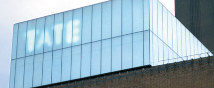
“We designed a range of logos that move in and out of focus, suggesting the dynamic nature of Tate – always changing but always recognisable.”
Wolff Olins
With a constantly changing logo, the effect on brand recognition and the design is far enough away from the norm to allow for slight variations across the board.
There are a number of variations of the Tate logo, or mark. They range from a standard logo to a blurred version, a faded version and a halftone version (dots rather than smooth fading). The marks have no fixed size or position and they are not connected with one particular Tate site. The Tate mark helps to build a brand that is fresh and fluid, but has some consistency – one Tate, with constantly changing expressions.


So, this make the identity more distinctive and effective.The logo is memorable in that it’s consistently in different focus.The constant change in form presents the viewer with a modest “challenge of recognition”. This only works of course if the variation between the different logos is limited to the same basic shape determined by the letterforms.
Sem comentários:
Enviar um comentário